
Micio Rebrand.
Musubi was approached by Micio, one of Australia’s premier wayfinding and branded environment design firms, to elevate their corporate identity. Micio sought a brand transformation that would not only highlight their technical expertise but also position them as leaders in an industry ripe for innovation.
At Musubi, we take pride in developing world-class brand identities that resonate with the core values and future vision of our clients. For Micio, we crafted a design language that speaks directly to their target market, those who understand the importance of technical prowess, wayfinding expertise, and cutting-edge 3D design.
Our approach was rooted in a deep understanding of the industry’s complexities and the challenges and opportunities that lie ahead. We created a brand identity that conveys Micio’s mastery of spatial branding while signaling their readiness to navigate and shape an industry in the midst of significant transformation. This new design language distinguishes Micio from competitors by providing a fresh perspective, moving away from outdated solutions and embracing the future with confidence and clarity.
Through meticulous research and a collaborative process, Musubi developed a cohesive and impactful brand identity that positions Micio as the go-to firm for clients seeking innovation in wayfinding and branded environments. Every element of the new identity, from the logo to the visual assets, was designed to communicate Micio’s deep industry knowledge and forward-thinking approach.
In a landscape where traditional answers no longer suffice, Musubi has equipped Micio with a brand identity that not only reflects their technical expertise but also their ability to lead in a changing world. This rebrand ensures that Micio is recognised not just as experts, but as pioneers in the evolving field of spatial branding.

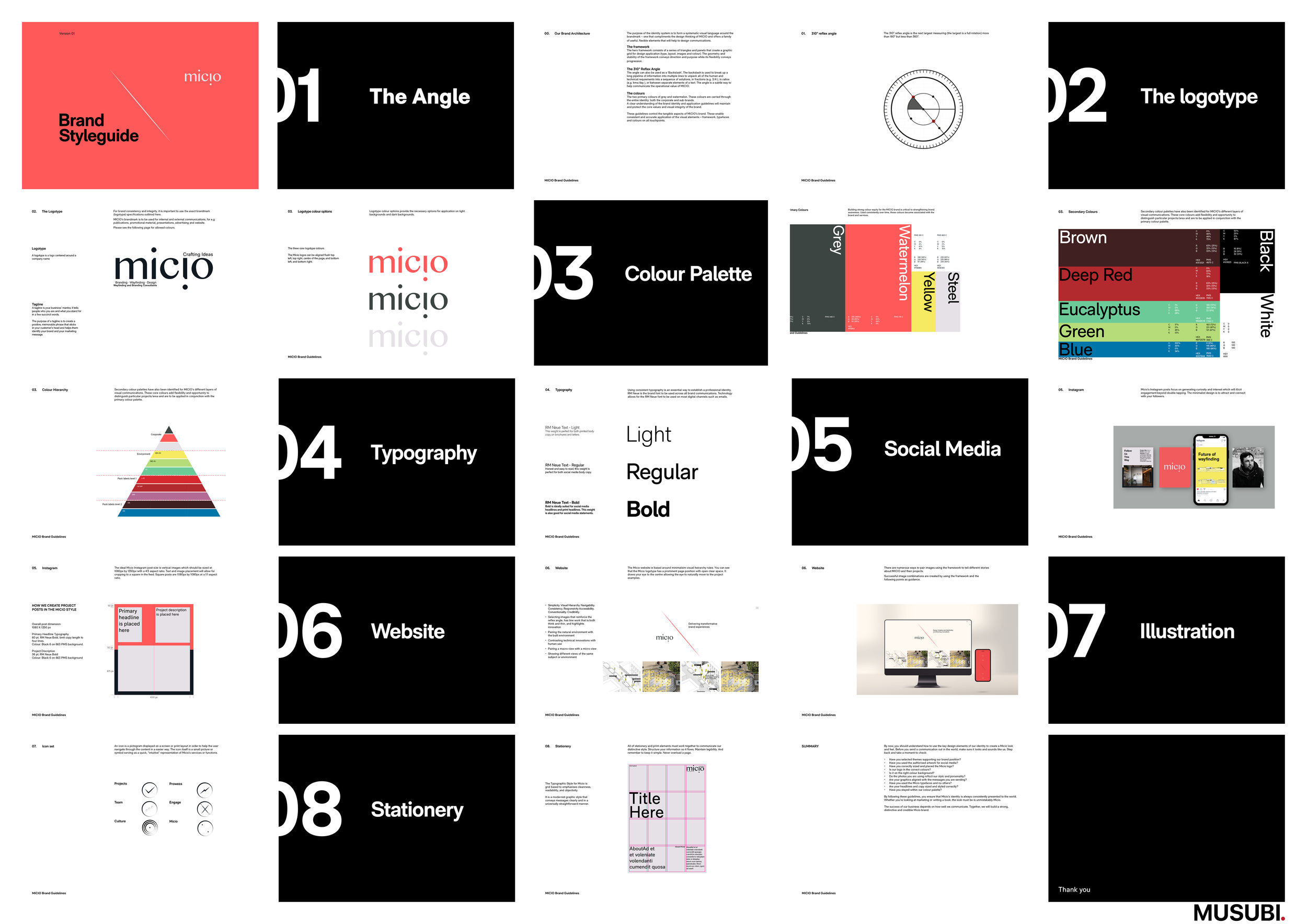
Powerfully flexible colour palette and clear standards.

Micio works alongside design-led clients, architects, and major builders to support the physical translation of a brand across single or multiple sites.
The brand carriers Micio creates must convey information effectively and attractively, while retaining the language, style and atmosphere of the space. It is for that reason that they turned to Musubi to rebrand their firm and design their brand standards to world-class standards.

Precision.
Logotype designed with an underlying structure with angles linked to nature. Type offering strong contrast between thick and thin strokes, and an overall geometric construction.
We designed a whole new way for Micio to present how the client, architect, builder, and end user are incorporated into their process and where ingenious ideas and solutions are explored and where cost savings can be found.
Complexity made simple.

Micio translates 2D designs to come to life within 3D environments, so Musubi developed a visual language that anchors from a 310 degree isometric plain.
Micio’s innovative and ingenious approach is the hinge between 2D and 3D creative exploration.
The 310 degree angle can also be used as a ‘Backslash’. The backslash is used to break up a long pipeline of information into multiple lines to unpack all of the human and technical requiements into a sequence of solutions, in fractions (e.g. 3/4 ), in ratios (e.g. kms/day ), or between separate elements of a text. The angle is a subtle way to help communicate the operational value of MICIO.
Multilayered visual language.

The Australian colour palette is widely known as the Land of the Seven Colours. After careful study of the colours and how they have been used through out history, we arrived at a set that helps express maturity, intellective, positive, vital, and anchored to permanence.
Borne from Australia.
Within structure there is freedom to give clients the best possible wayfinding and branded environmental designs solutions.