Karate Academy of Power.
When developing the brand identity for the Karate Academy of Power, we sought to capture the essence of strength, discipline, and mastery that defines the dojo’s approach to martial arts.
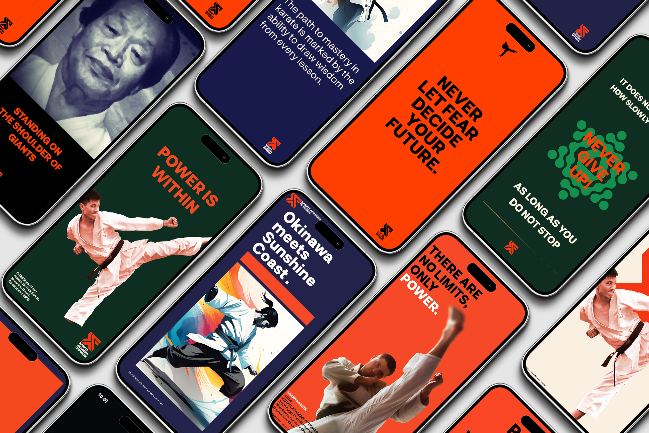
Our design process began with the creation of a bold and dynamic logo, featuring powerful, angular lines that symbolise precision and force. The logo is an emblem that represents the unbreakable spirit of a karateka, merging Karate form with a modern aesthetic. The colour palette represents the link between Okinawa and Australia by deep oranges, blacks, green, navy, and white. The colours evokes intensity, focus, and the rich heritage of karate. whilst fixed on the future.
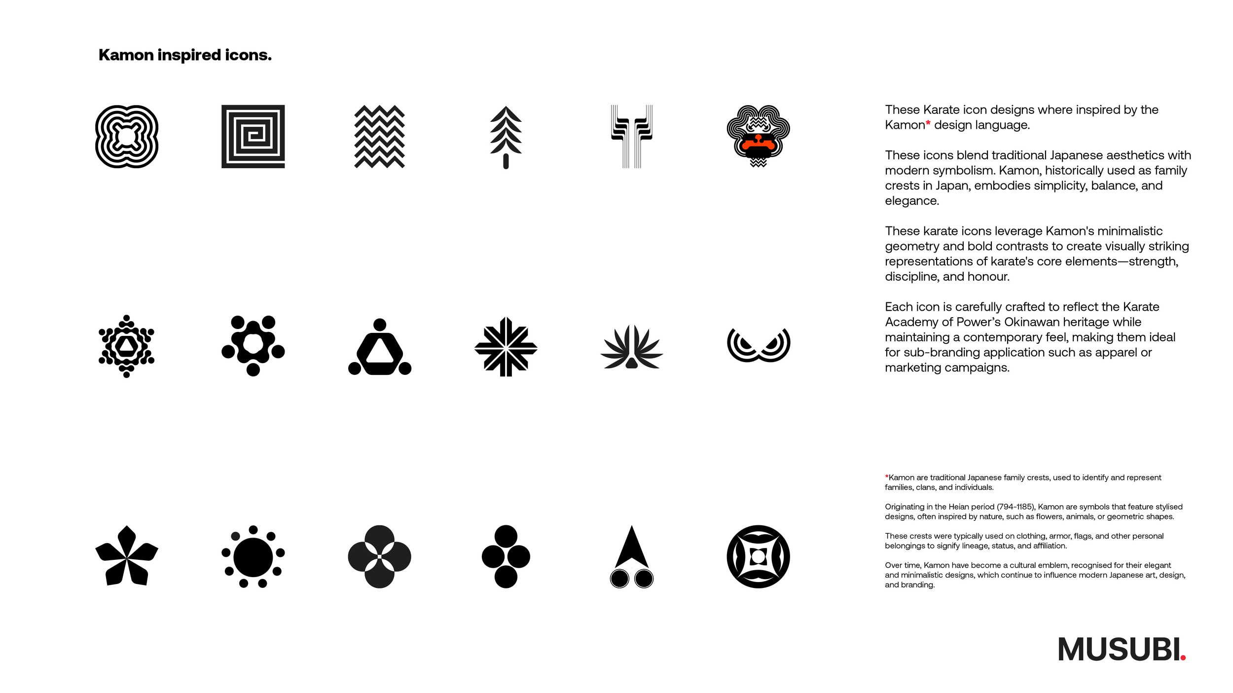
To ensure the brand identity resonates with both students and the broader community, we developed a suite of visual assets that extend across all dojo touchpoints. From uniforms and signage to digital platforms and promotional materials, every element is designed to reinforce the academy’s commitment to empowering individuals through karate. The typography is strong and assertive, mirroring the discipline and determination that the dojo instills in its students.
Our messaging strategy centres on the values of power, respect, and growth. We crafted a voice that speaks to the journey of personal and physical empowerment, positioning the Karate Academy of Power as not just a place to learn martial arts, but as a community where individuals can grow in strength and character.
Through this brand identity, we’ve created a powerful, cohesive representation of the Karate Academy of Power, a dojo where tradition meets modernity, and where every student is empowered to reach their full potential.


